A better converting STRATO landing page
STRATO
Is a web hosting and web design company. They build their clients websites with the power of AI and their site-builder.
Headquarters
The Hague, NL
Industry
Web Design, SaaS product
Services
- Visual identity
- Landing page design
- UI/UX design
- Design system
The client
STRATO has many landing pages upselling their various products.
The challenge
The issue is that their landing pages don't upsell their products that well. They are filled with lazy, uninspired design choices and frequent text mistakes, likely due to the fact that the sites were built by AI.
Solution
I redesigned one of their product landing pages. Focusing more on professionally designed visuals, varied design choices and reworked CTAs and USPs that help upselling the product,
Sitebuilder landing page

More upselling
The first thing you see when opening up the old page is this here section. I really felt like it was a missed opportunity to convince the reader to buy their product, so I made a AI powered site builder illustration and made sure to have a button letting you buy the product. In order to urge the user, I also put a countdown, suggesting that this is a limited time deal.
Clearer pricing and discounts
It wasn't obvious how big of a discount you were getting in the initial designs, so I made sure to show the yearly prices on offer in comparison to the 12 month monthly price and I made sure to highlight the discount you get.
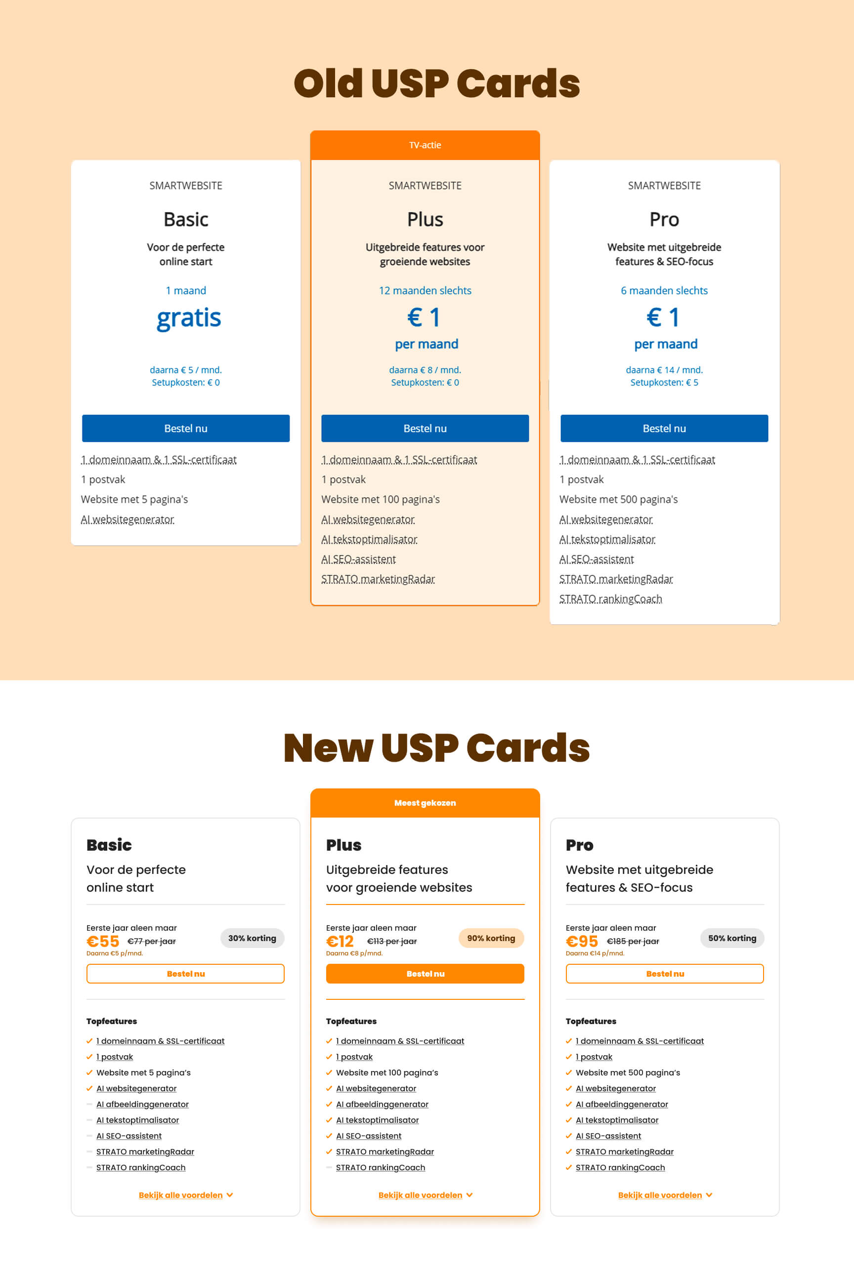
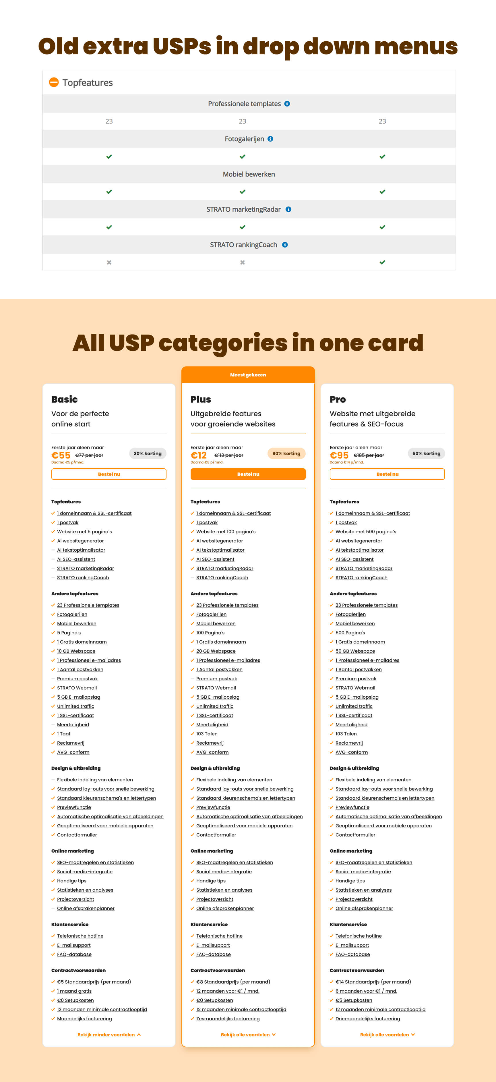
All feature USPs in one place
In the original design you have the product cards appearing two times on the site. The second time they appear, they decide to show all of the extra features in these drop downs. In my opinion this is a waste of site real-estate and should be merged in one place, because readers might not scroll down that far. Thus increasing the chance of user conversion by having all of the information they need in one place if they click "Bekijk alle voordelen"
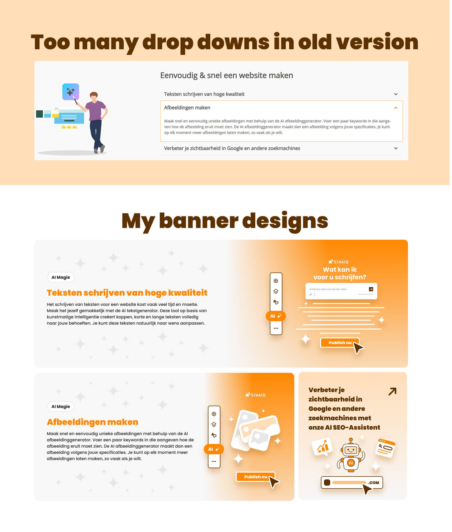
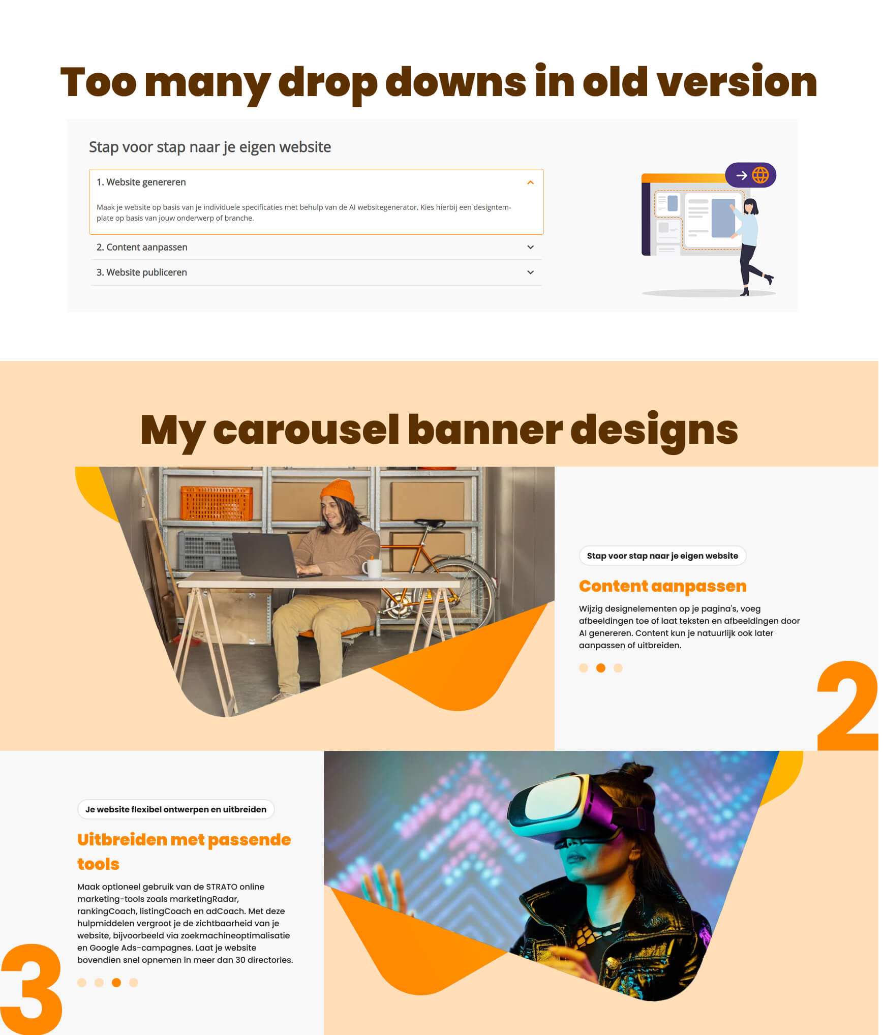
Varied site elements
A site is usually more visually apealling when it has a variety of elements. The initial site usually has these dropdowns and an illustration next to them, that upsell the product. The thing is, it could be presented way better. That's why I made banner and carousel banner elements, making sure the content is eye-catching and readable.
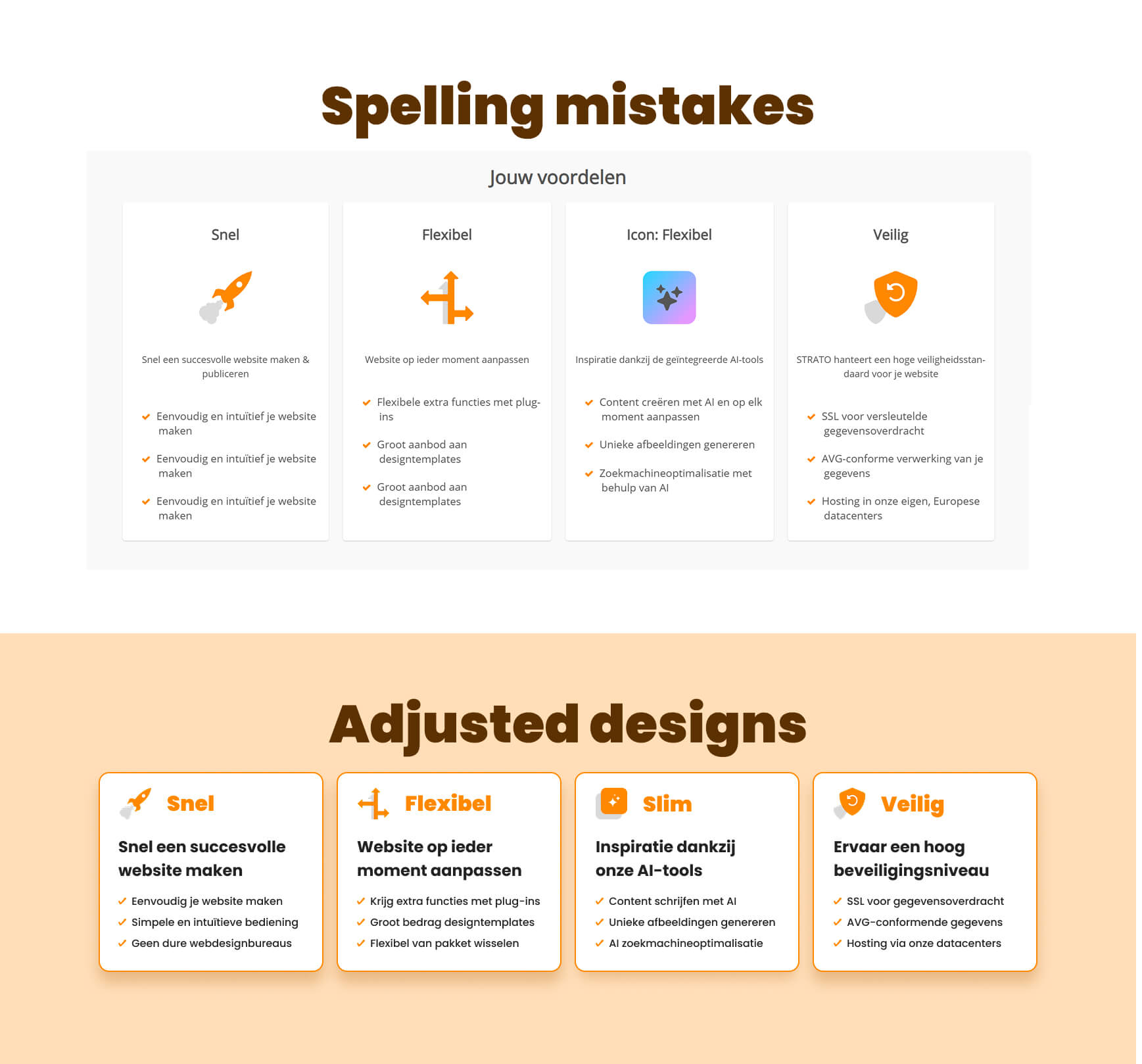
Text errors
It's crazy to think that such a well known company has spelling errors on their product, but that's likely because they built these pages with AI and didn't check it properly before going LIVE.
Regardless, I came up with new copy, fixing their USPs and I made the images smaller, because they don't help with upselling the product here.
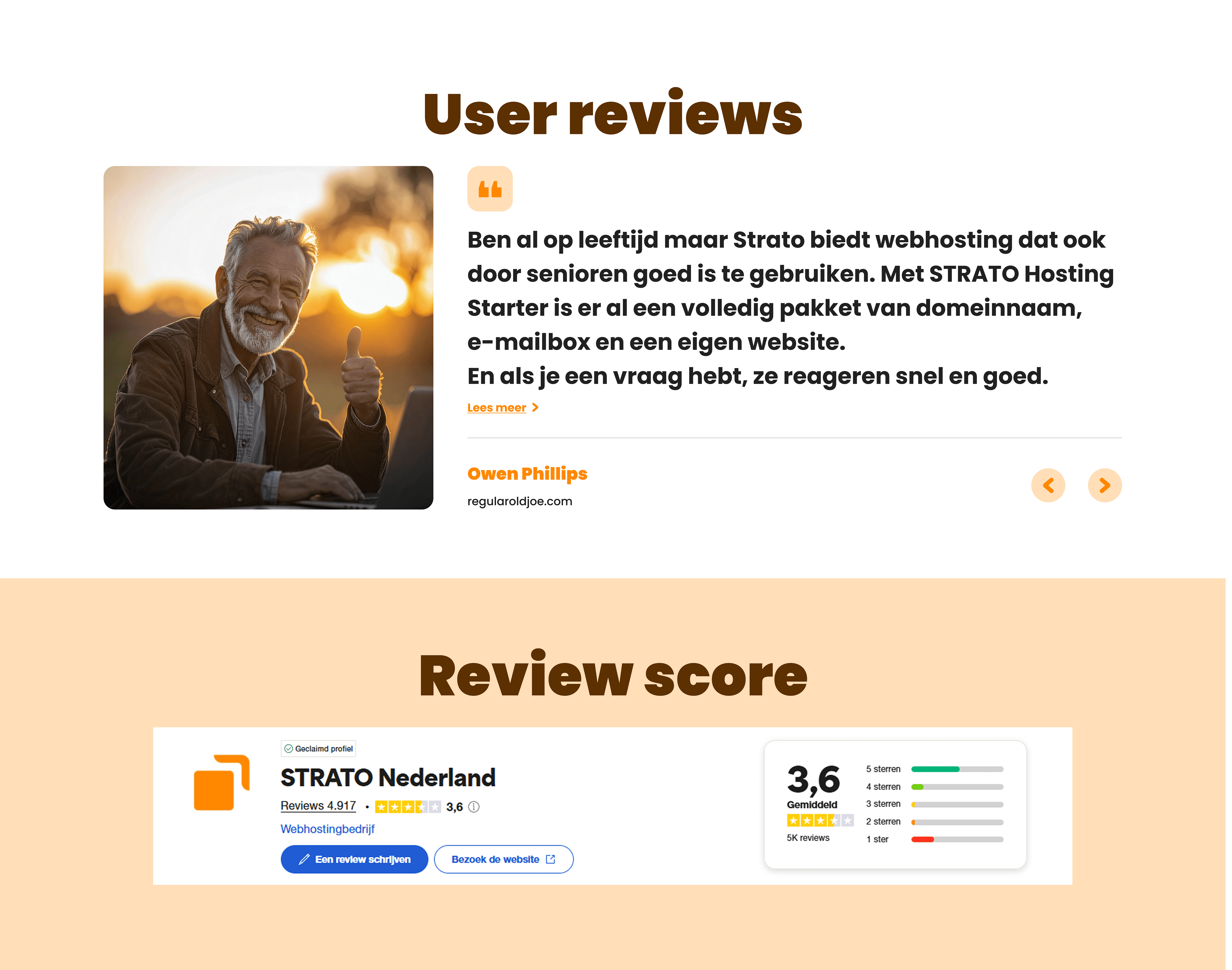
Building credibility
In the initial designs, the company chooses not to display their review scores - likely because they have a low score of 3.6 on Trustpilot, but they do have some positive reviews, so I opted for highlighting selected reviews on their page in an effort of building credibility with readers.
Custom illustrations
To better visualise and upsell the AI magic within their product, I made some illustrations. I like them more than the illustrations on the old site. They visualise an AI site builder, an AI copywriter, an AI image generator and an AI SEO optimiser.