Building a brand identity and a landing website for Groeispurt Workshops
Groeispurt Workshops
Is a website I created for the company Groeispurt, to help advertise their educational workshop services towards educational institutions in The Netherlands.
Headquarters
Amsterdam, NL
Services
- Branding & Visual Identity
- UI Design
- Video & Static Content Creation
Industry
Education & Personal Development
The client
Groeispurt offers expert-led workshops for gymnasium and university students, focusing on career guidance, self-reflection, and personal motivation. Their sessions help students gain clarity, make informed decisions, and build essential skills for personal and professional growth.
The challenge
The challenge was to create a cohesive digital presence that resonated with university and gymnasium students while conveying professional career guidance and personal growth services to the staff of the educational institutions that would be hiring Groeispurt for their services.
The goal was to design a landing page and brand identity that felt both professional and approachable, addressing the needs of a young, dynamic audience looking for clarity in their career decisions.
Solution
I developed a brand logo and style guide to create a clear visual identity.
For the landing page, I focused on a clean, natural & friendly vibe for the UI design to communicate the company’s services & values effectively.
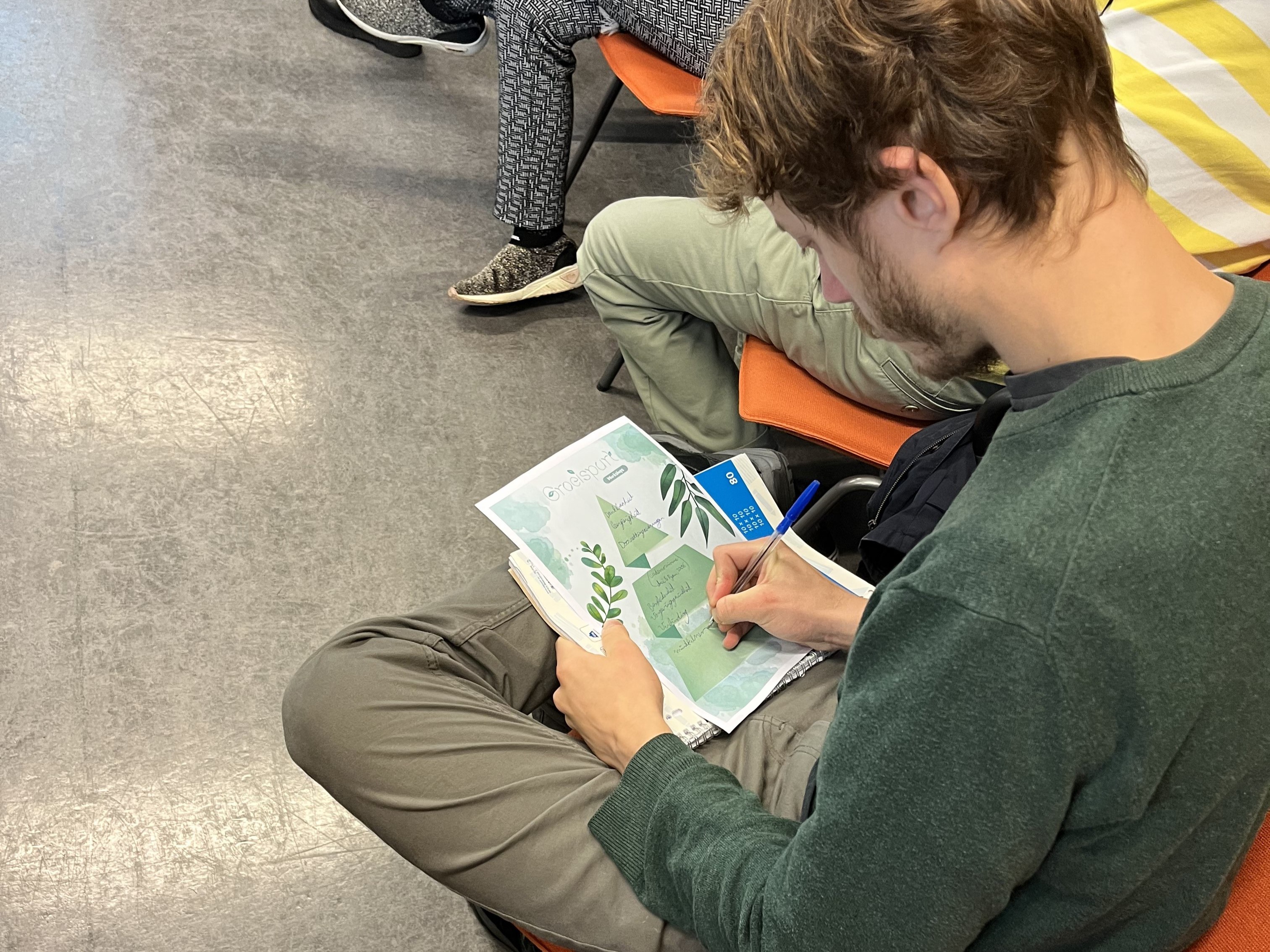
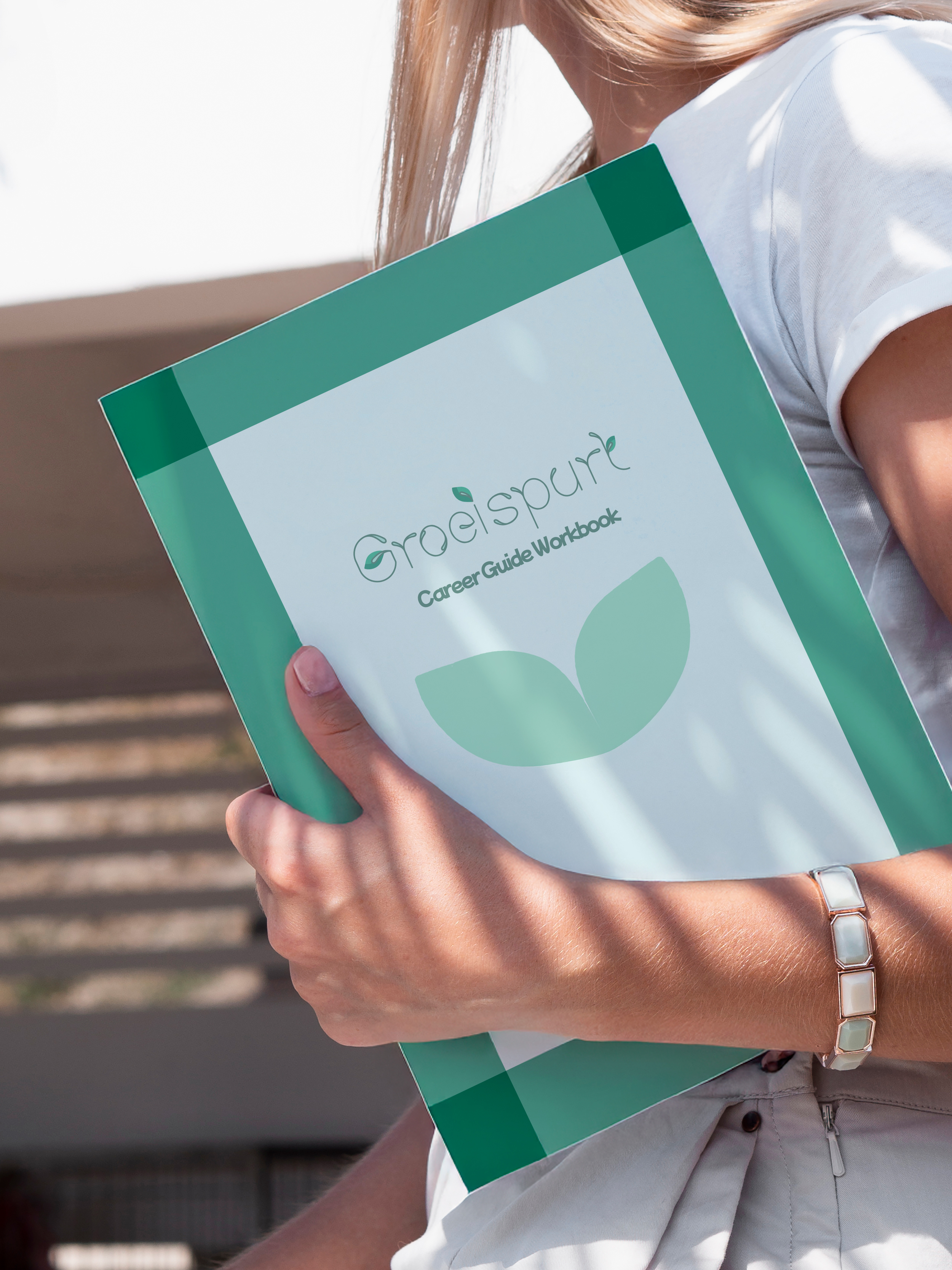
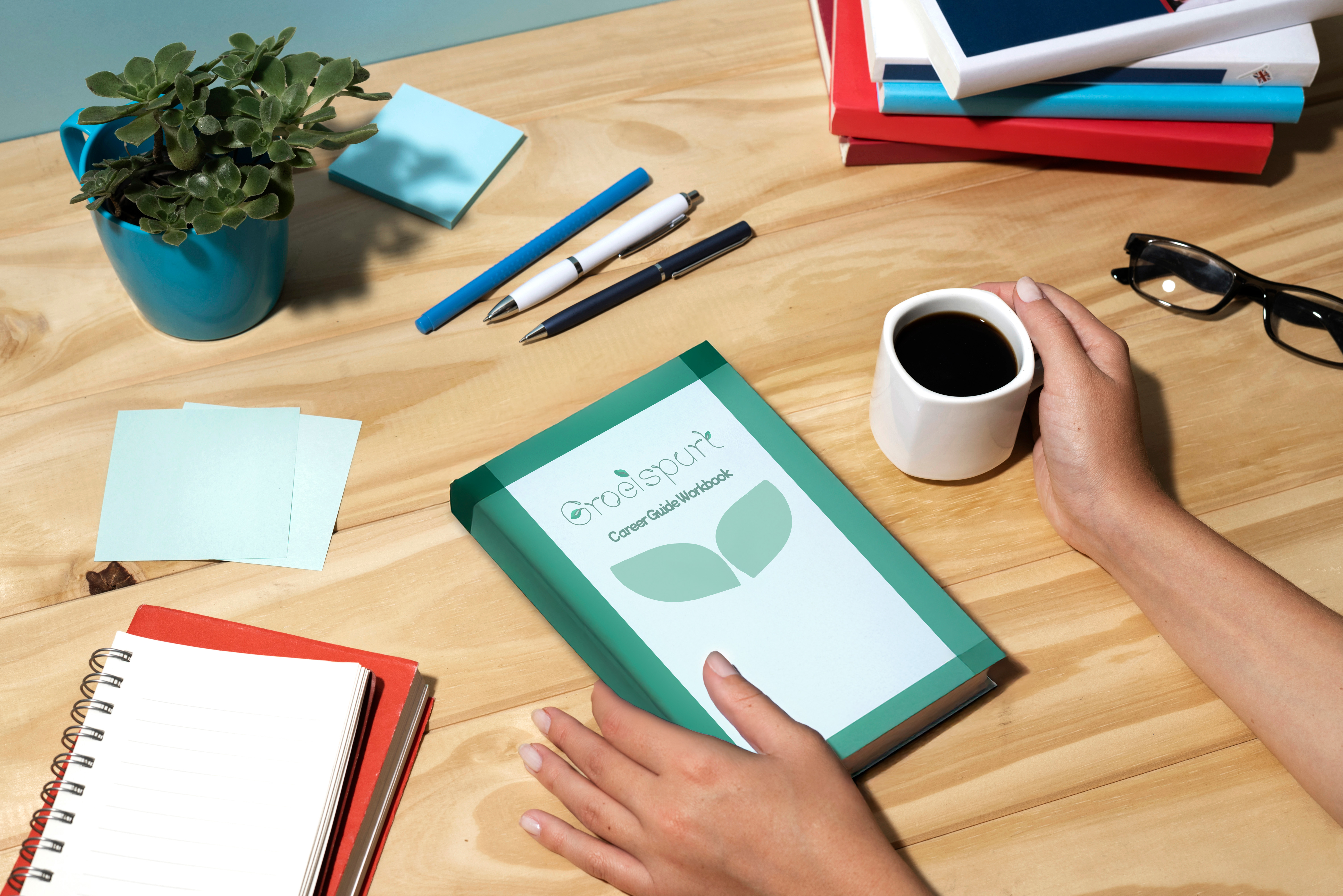
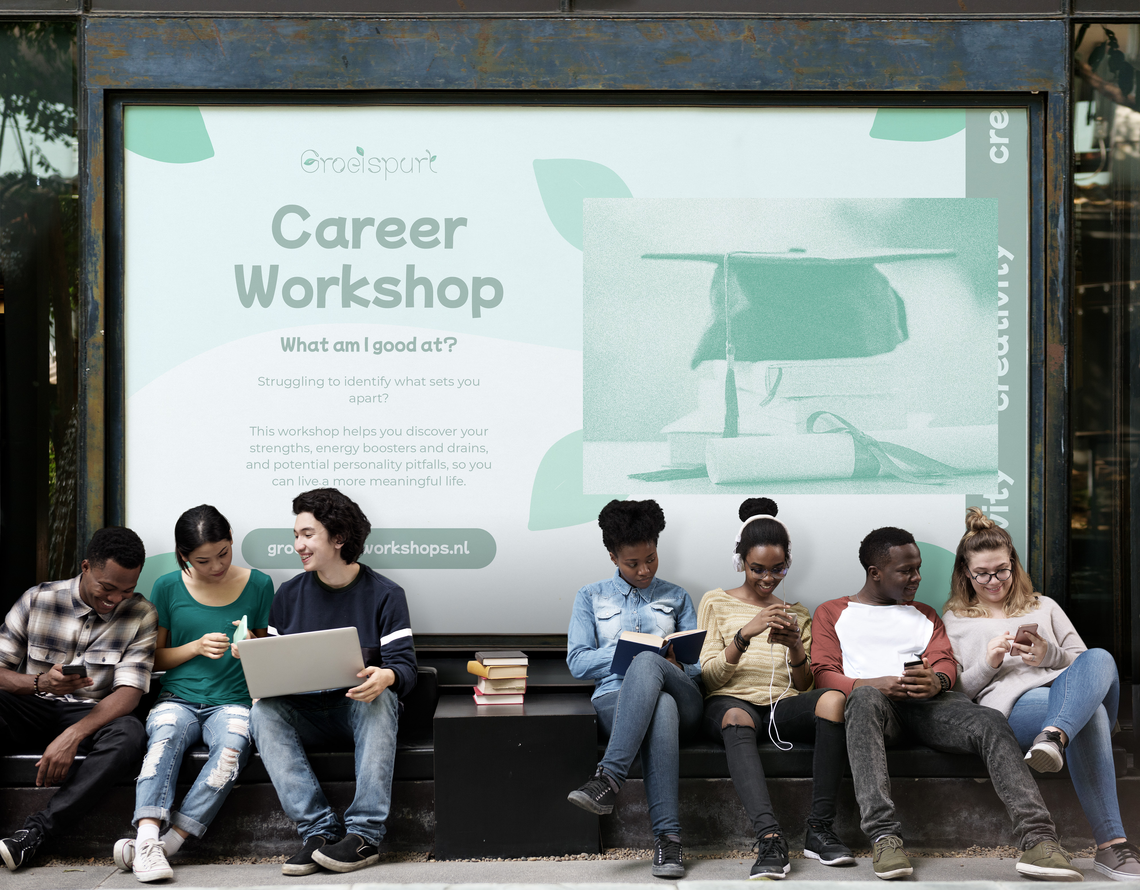
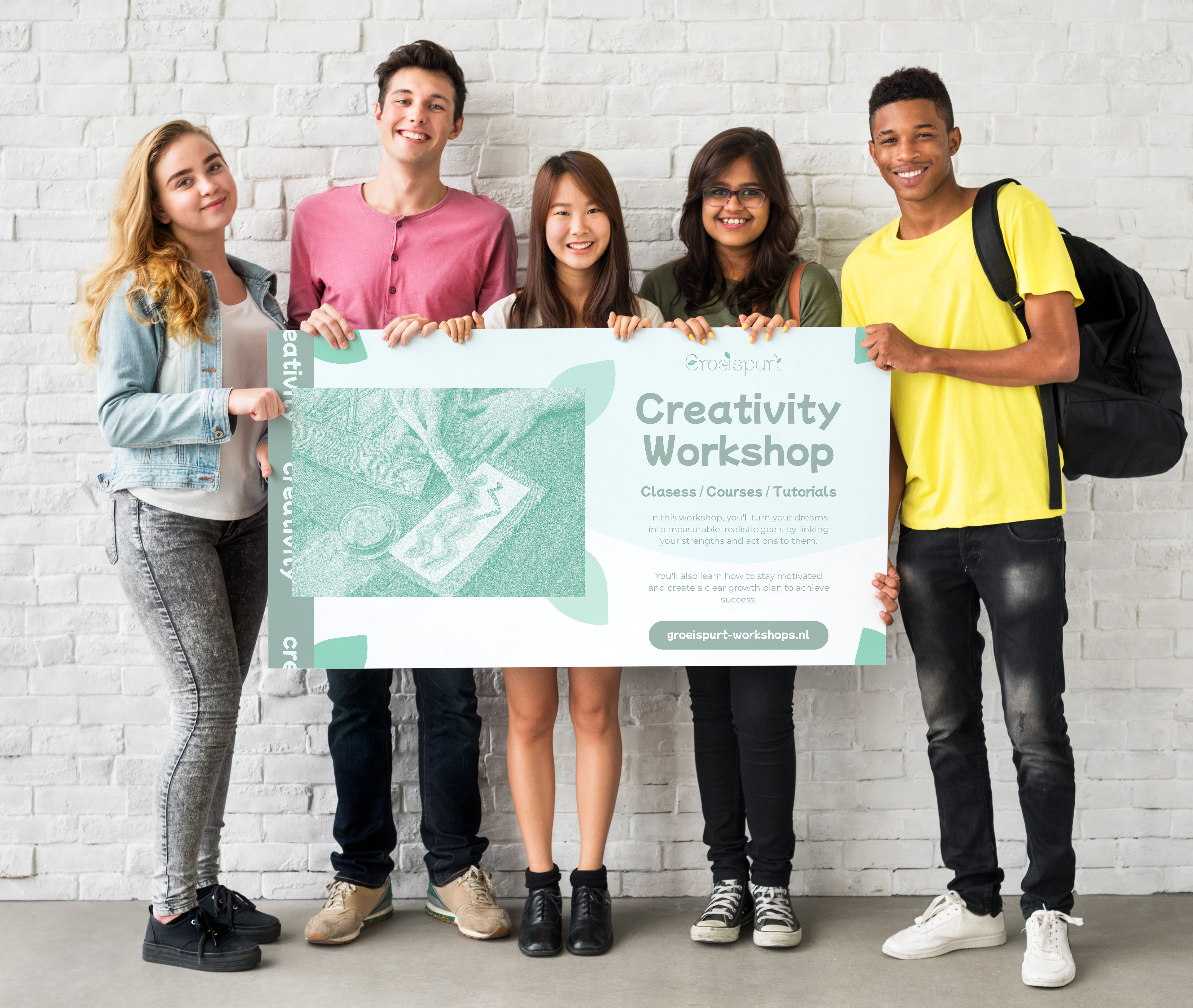
To help showcase how the brand would translate into real-world applications, I created mockups of the workbooks and workshops, giving a tangible sense of their offerings.
Additionally, I produced a promotional video that aligned with the brand identity, helping to convey the company’s value to educational institutions to further establish trust and credibility.
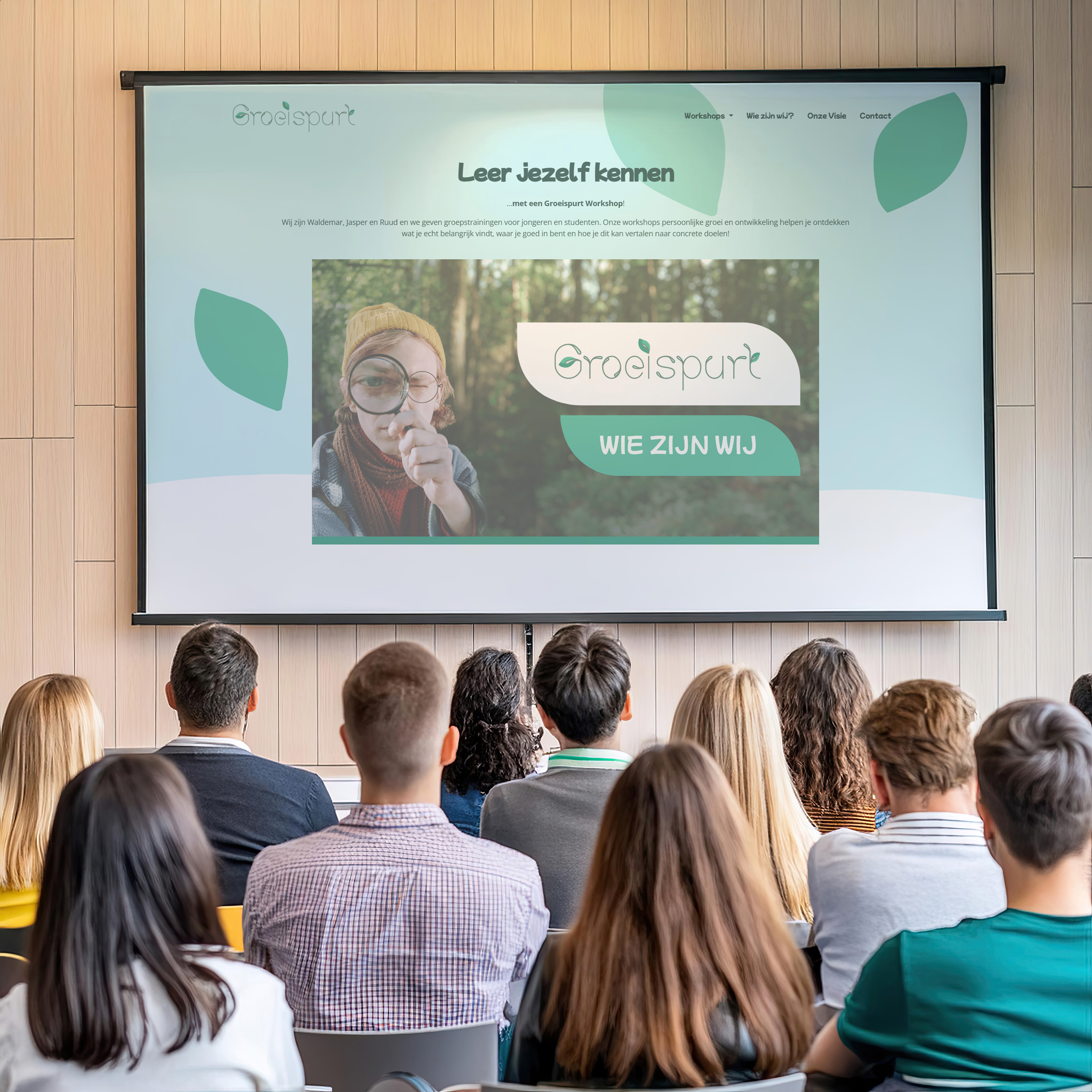
Cultivating a Brand from the Ground Up
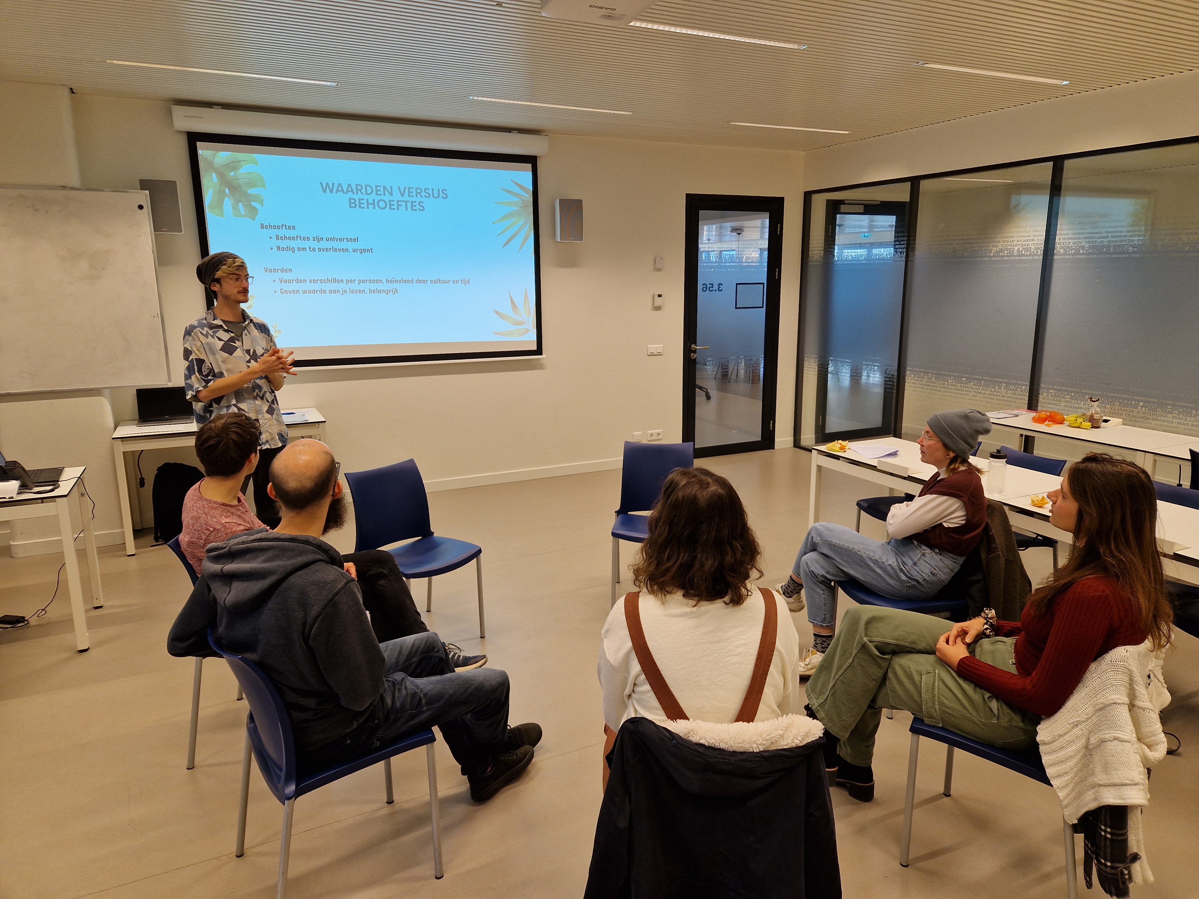
When Waldemar, Jasper, and Ruud approached me, they had no brand identity—just the concept of student workshops. After learning that "Groeispurt" means "growth spurt" in Dutch, I developed a logo that symbolized the nurturing of student potential. Initially considering a leaf design, I guided them toward a minimalist approach, selecting a font that subtly echoed nature. We decided against overly complex elements like their original request of a growing bean, focusing on simplicity for a versatile, adaptable logo.
Following the logo creation, we held a creative session to define the brand’s visual style, selecting colors and imagery that resonated with their mission. I then crafted mockups to showcase how the brand would look in action, ensuring consistency across their digital and physical presence.
.jpg)
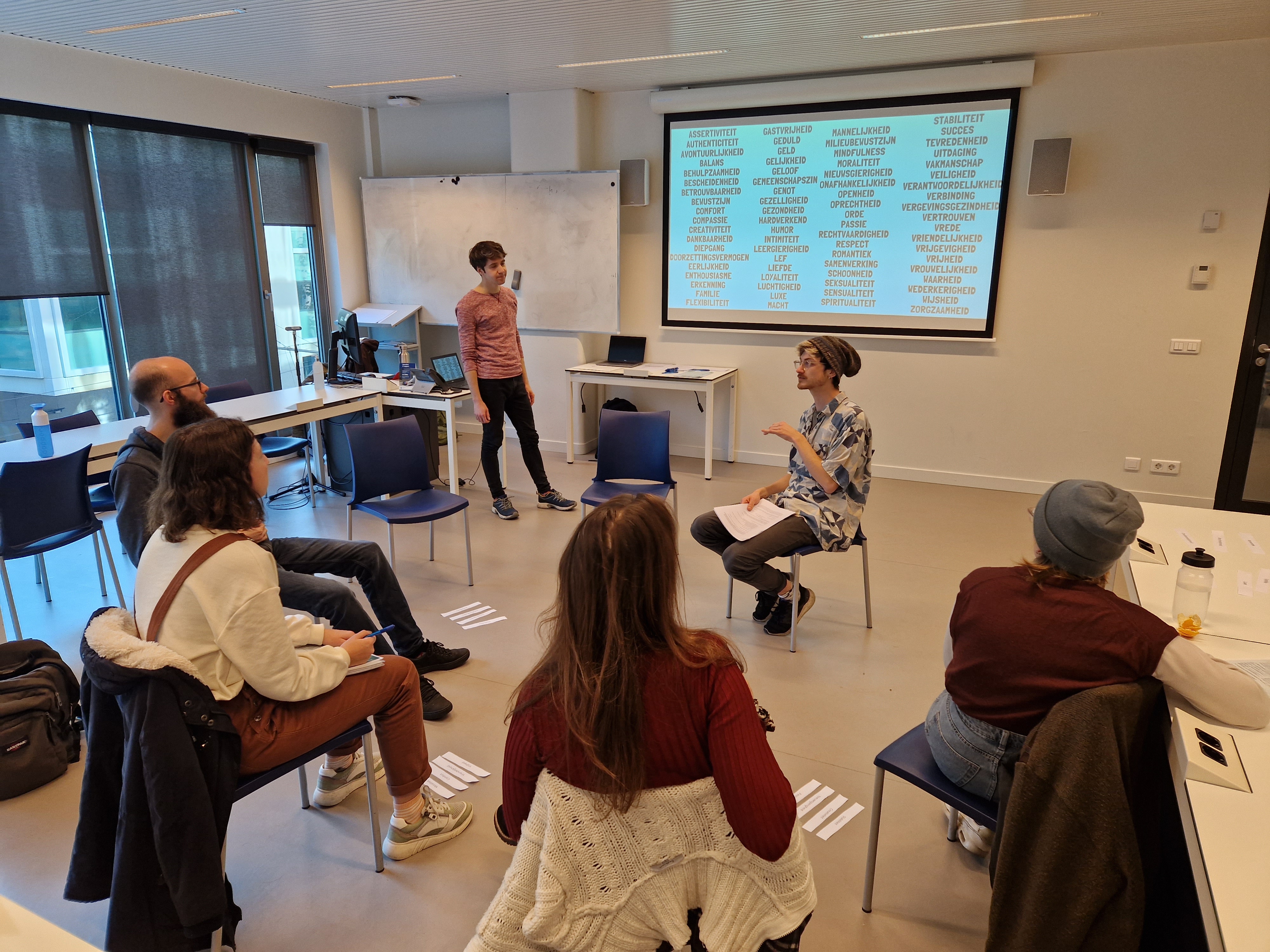
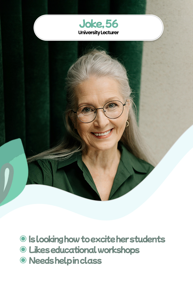
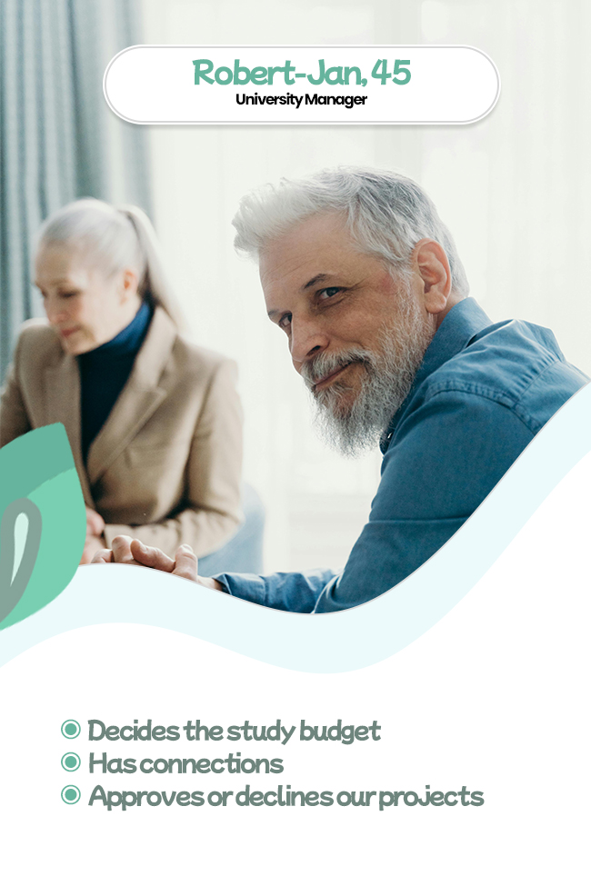
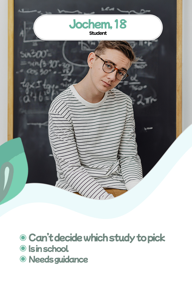
Crafting Personas that shape the site
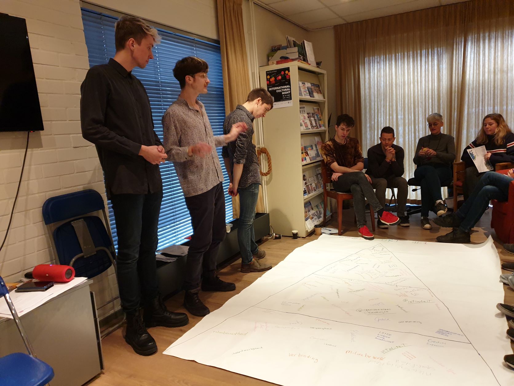
After finalizing the brand’s visual identity, we sat down with the founders for a creative session to dive into the minds of their target audience. This helped us craft reader personas, giving us a clear picture of who we were designing for.
By understanding these users better, we could make smarter choices about the site’s copy and content, ensuring everything spoke directly to their needs and motivations. This step was key in making sure the website would truly connect with its readers.

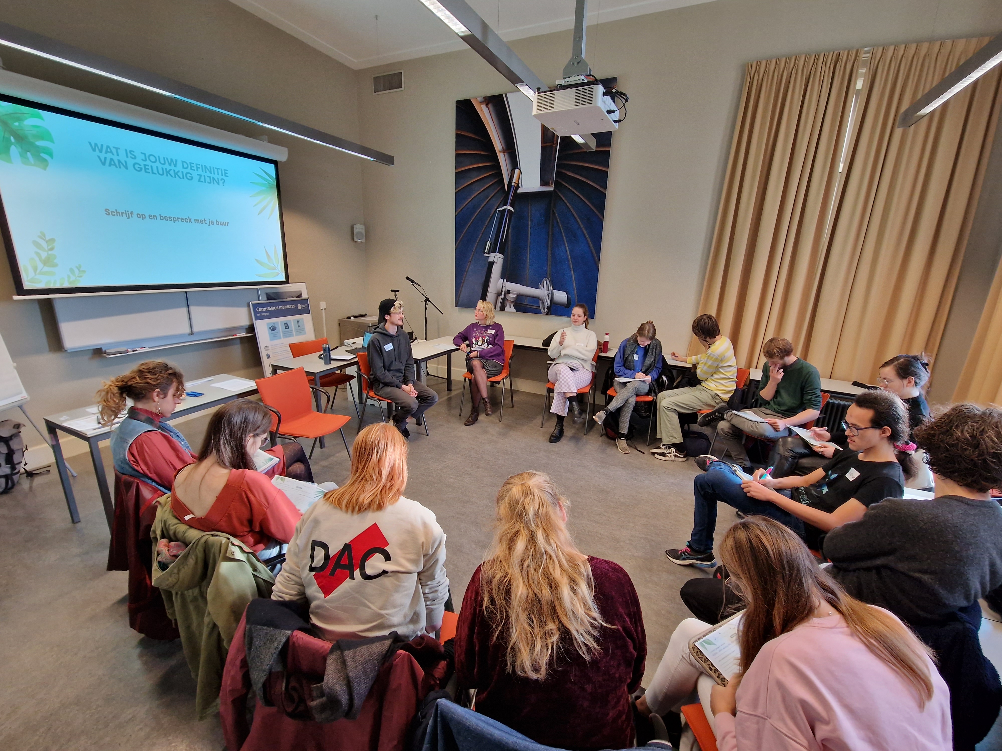
From Ideation to Execution: A Structured Approach to Crafting an Effective Website
To begin the design process, we first facilitated a Future Workshop, where we asked the question, "What functionality and content would your perfect website have?" This collaborative brainstorming session generated a wide range of ideas, helping us understand the needs and desires of the target audience.
Next, we used the MoSCoW method to prioritize features from the Future Workshop output, identifying the “Must-Haves,” “Should-Haves,” and “Could-Haves.” This allowed us to focus on the essential elements for the MVP (minimum viable product) and ensure we weren’t overwhelmed by too many options.
With our core features decided, we moved on to visualizing the structure of the website through a sitemap. This step helped us establish the site’s flow and layout, providing clarity on the user journey and content organization.
Finally, we took it a step further by creating lo-fi wireframes for the homepage, visualizing the key elements in place. This provided a clear blueprint for the site’s design, setting the stage for a more detailed, user-focused experience moving forward.


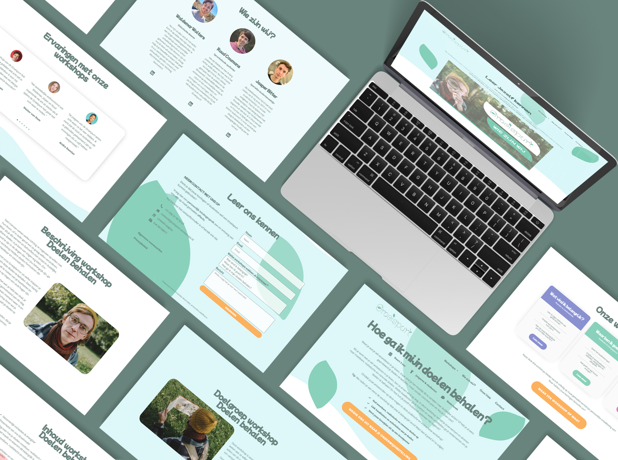
Final outcomes for the website
I created an initial design that closely adhered to the style guide and wireframes, ensuring a strong foundation for the website. After review, only minor content adjustments and layout rearrangements were needed. This streamlined approach allowed for a smooth handoff, with the website ready for content to be filled in and fine-tuned as needed, ensuring a polished and cohesive final product.
A video advertisement representing the brand
As my final contribution to the project, I collaborated with the founders to script, record voice overs, and edit the Groeispurt promotional video.
This video became a powerful addition to the site, bringing the brand’s mission to life and adding a dynamic element to the overall design.